hey all,
A little UI analysis from Total War: Warhammer this time. I've only put about 20 hours into this game over the last several weeks, but I have noticed some really amazing and (IMHO) really crappy UI design. On the plus side, there is the map UI. You can see a city and an army icon in the image below. The army is marked by the humanoid figure and the the flag, while the city is the group of buildings partially blocked behind him. The yellow outlines show how far the unit can move during a turn. Everything the player might want to know is shown clearly, or can be displayed with a single click: clicking on the city would display the upgrades it has and that are available, while clicking on the army would show the general in charge and the units, their health and experience levels.

Should you wish to invest skill points in abilities, the player can use the menu below. Again, while functional and basically clear, please notice the arrow. I played the game for over 40 turns, that's about 12 hours, before I noticed those little spheres. It turns out that when they are uncolored you have not or cannot invest in the skill. The number of spheres shows the number of times you can invest in that skill. Maybe I am just not observant, but any pretty critical UI element that the player only discovers after 12 hours is not doing its job. Increasing the size of them, making them flash, using highlighted numbers, or breaking each button into sections which progressively become filled in would be improvements.

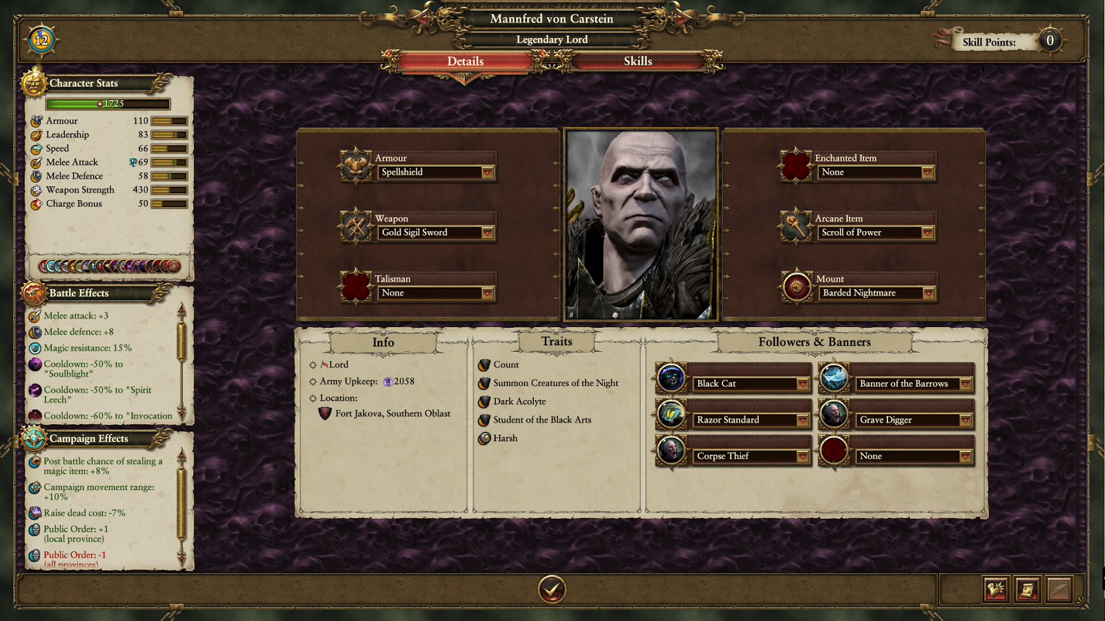
The next two shots show parts of the UI for generals and cities. The arrows point to elements that allow the player to view the next general or city. Similarly to the spheres for skills, I discovered these after a few hours of play. They blend in a little too well with the background and look so much like decorative elements that they are easy to ignore.


Back on the plus side, there are a large number of events: wars, diplomatic changes, construction project completion, research completion, and generals leveling up. Below the map, there is an event panel list which displays these events. By clicking on them, the player can get more information, and even go to the location of the event.

Last one. When you select a general from the map, you get this panel in the lower left corner. It shows a portrait, the current level and how much progress to the next level, the items currently equipped, and the general's stance. The last is in the lower right corner, and similar to other elements in the UI, I did not discover this until about 30 hours into the game. Granted, it has been quite some time since I played a strategy game, but the basic tutorials are really lacking a few elements.

Cheers,
No comments:
Post a Comment